Movie review by Andrea Karen Hammer
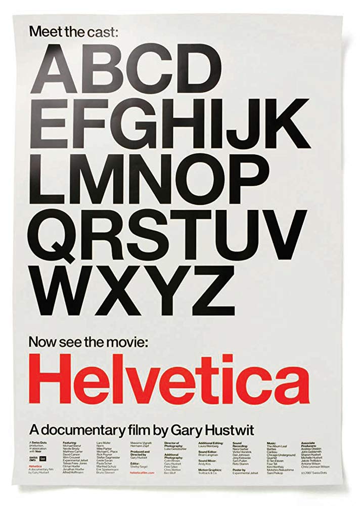
Graphic designers and others curious about the impact of typography on our daily lives will find the documentary Helvetica fascinating.
The film raises awareness about the often imperceptible ways that font selections shape and inform visual communication. In a sequence of ongoing frames throughout the Helvetica documentary, director Gary Hustwit provides undeniable evidence of the prevalence of this popular font. Intriguing interviews with graphic designers around the world reveal their often passionate reactions to Helvetica and other design debates.
Interviews Expand Discussion About Typography and Design
Some of the notable conversations about typography included those with graphic designers Erik Spiekermann, Matthew Carter, Massimo Vignelli, Wim Crouwel, Hermann Zapf, Neville Brody and Stefan Sagmeister. Others of interest revealed the thought process of Michael Bierut, David Carson, Paula Scher, Jonathan Hoefler, Tobias Frere-Jones and Experimental Jetset. Michael C. Place, Alfred Hoffmann, Mike Parker, Bruno Steinert, Otmar Hoefer, Leslie Savan, Rick Poynor and Lars Muller also enlarged some of the design debates.
Their conversations prompted viewers’ ongoing thoughts about the question: Should type simply hold and present information rather than distract from the content? Other particularly memorable points involved the comparison of font selections to casting directors’ choices in films. Some graphic designers‘ discussion about their resistance to “boring” font selections in artistic projects, such as the creation of album covers, also left a lasting impression.
Graphic Design as a Reflection of Changing Times
The film Helvetica captures different approaches to graphic design as a reflection of changing times. Overturning a long period following a linear and straightforward approach to graphic design, several of the interviewees discussed their rebellion in positioning type in different directions and introducing non-traditional elements including dingbats.
One of the strongest aspects of Helvetica by director Gary Hustwit is pointing out the regular appearance of the font, which often functions on a subconscious level. From street signs and restroom markers to branding campaigns for companies like Target, this font frequently dominates visual communication.
Elevation of Typography and Design Beyond the Predictable
With the help of talented graphic designers like the ones in the Helvetica documentary, the elevation of visual communication becomes possible beyond this prevalent–and sometimes predictable–choice.